

Page Navigation


Select a different country or region to view content tailored to your location.


Chris Cammack is the Partner Manager and a financial writer at FxScouts. Chris builds and maintains our relationships with our partners to provide our users with the best Forex trading experience.

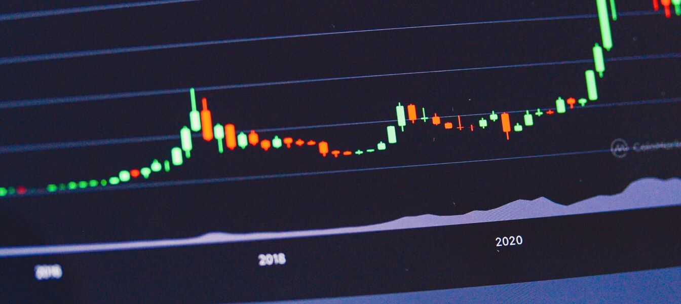
Candlestick charts are one of the most widely used tools in technical analysis and are central to how many traders read and interpret price action. Today, we will cover what candlesticks are, where they come from, how to read them, and how traders use both individual candles and candlestick patterns to make informed trading decisions.
Candlestick charts originated in Japan more than 100 years before similar charting methods, such as bar charts and point-and-figure charts, were developed in the West. Their longevity and continued relevance highlight their effectiveness in visually representing price movement and market sentiment.
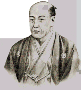
The origins of candlestick charting date back to the 1700s, when a Japanese rice trader named Homma observed that price movements were influenced not only by supply and demand, but also by the emotions of market participants. Fear, greed, and indecision all played a role in price behaviour.
Candlestick charts were developed as a way to visually capture these emotional dynamics. By using distinct shapes and colours, candlesticks provide traders with a fast and intuitive way to assess price action and underlying market sentiment at a glance.
Candlesticks are a form of price charting that displays four key pieces of information for a specific time period:
Each candlestick represents all of this information within a single visual unit. The time period covered by a candlestick depends on the chart’s timeframe. On a one-minute chart, each candle represents one minute of price data, while on a daily chart, each candle represents an entire trading day.

To read candlestick charts effectively, it is essential to understand their basic structure. Much like learning letters before reading words, understanding individual candlesticks is the foundation for recognising meaningful chart patterns.
A candlestick typically consists of two main components:
In some cases, a candlestick may lack one or both wicks, or have an extremely small body. Regardless of its shape, every candlestick contains the full price information for its timeframe.
The colour of the candlestick body indicates the direction of price movement over the period. The most common colour scheme uses green candles to show that the price closed higher than it opened, and red candles to show that the price closed lower than it opened.
Throughout this article, green candles represent upward price movement, while red candles represent downward price movement.

The relationship between the body and the wicks of a candlestick can reveal a great deal about market sentiment. Both the absolute size of the candle and the proportions between the body and the wicks matter.
Long candle bodies suggest strong directional momentum, while short bodies indicate hesitation or balance between buyers and sellers. Long wicks show that price moved significantly in one or both directions before being pushed back, often signalling rejection of higher or lower prices.

One of the most important candlestick formations to understand is the doji. A doji forms when the opening and closing prices are almost identical, resulting in a very small candle body.

This structure reflects market indecision. Buyers and sellers were active during the period, but neither side managed to take control by the close. The longer the wicks relative to the body, the greater the level of uncertainty and the stronger the struggle between buyers and sellers.
When a doji appears at the top of a strong trend, such as after five to ten consecutive green candles, it can signal that momentum is weakening and that a potential trend reversal may follow. However, dojis that form during sideways consolidation are less significant, as ranging markets already reflect indecision by nature.
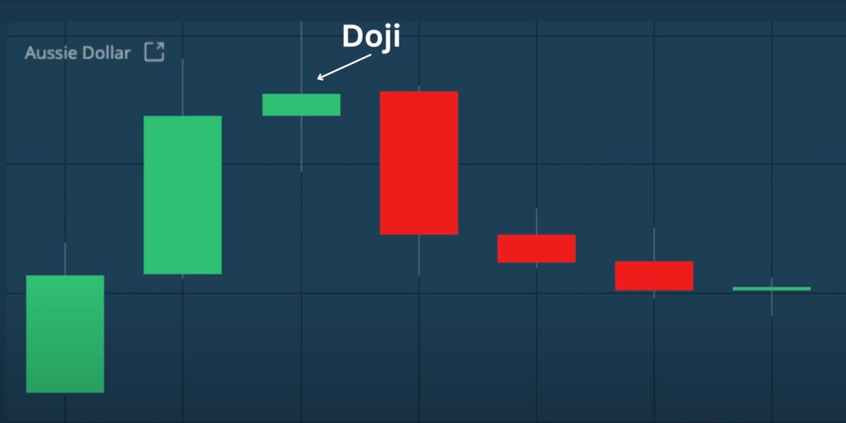
Dojis that occur during a period of sideways consolidation, however, are less significant because sideways price action really reflects indecision.

Another important candlestick type is the long body candle. These candles form when price opens and then moves strongly in one direction without significant pullbacks.
Long body candles reflect strong conviction from buyers or sellers. While traders ideally want to be positioned in the direction of the move as these candles begin forming, entering trades after a long body candle has already closed often carries higher risk, as much of the move may already be complete.
Used correctly, analysing individual candlesticks and their shapes can be a powerful way to understand short-term price dynamics.

Beyond individual candles, traders often look for recurring candlestick patterns. These patterns are formed by one or more candlesticks and can help forecast short-term price direction, identify potential trend reversals, and highlight areas of support and resistance.
Candlestick patterns are commonly divided into bullish and bearish categories, depending on the market context in which they appear.
Bullish candlestick patterns typically appear after a downtrend and suggest that selling pressure may be weakening and buyers are beginning to take control.
Hammer
The hammer has a short body and a long lower wick and forms at the bottom of a downtrend. It shows that sellers initially pushed prices lower, but buyers stepped in and drove prices back up. Green hammers are generally considered stronger bullish signals than red ones.
Inverted Hammer
The inverted hammer has a long upper wick and a short body. It suggests that buyers tested higher prices despite selling pressure and may be starting to gain control.
Bullish Engulfing Pattern
This two-candle pattern forms when a small red candle is followed by a larger green candle that completely engulfs it. The strong close of the second candle signals a shift from selling pressure to buying momentum.
Piercing Line
The piercing line consists of a long red candle followed by a green candle that opens lower but closes above the midpoint of the previous candle. This pattern indicates aggressive buying and a potential bullish reversal.
Morning Star
The morning star is a three-candle pattern made up of a long red candle, a small-bodied candle, and a long green candle. It signals the end of a downtrend and the beginning of a bullish reversal.
Three White Soldiers
This pattern features three consecutive long green candles with small wicks, each closing higher than the previous one. It reflects strong, sustained buying pressure and often signals the start of a robust uptrend.
Bearish candlestick patterns usually appear after an uptrend and indicate that buying momentum may be fading, creating opportunities for short positions.
Hanging Man
The hanging man resembles the hammer but appears at the top of an uptrend. It shows that sellers managed to push prices significantly lower during the period, warning that bullish momentum may be weakening.
Shooting Star
The shooting star has a small body and a long upper wick and forms during an uptrend. It signals that buyers failed to maintain higher prices and that selling pressure may be taking over.
Bearish Engulfing Pattern
This pattern occurs when a small green candle is followed by a larger red candle that fully engulfs it. It suggests a shift from buying to selling pressure and often precedes a market downturn.
Evening Star
The evening star is the bearish counterpart to the morning star. It consists of a long green candle, a small-bodied candle, and a long red candle. The pattern is especially strong when the final candle erases most or all of the gains from the first.
Three Black Crows
This pattern features three consecutive long red candles, each opening near the previous close and closing lower. It signals strong, sustained selling pressure and a potential bearish trend.
Dark Cloud Cover
Dark cloud cover forms when a red candle opens above the body of the previous green candle but closes below its midpoint. It indicates that sellers have overtaken buyers and driven prices sharply lower.
While candlestick patterns can provide valuable insights into price behaviour, they should not be used in isolation. Confirmation from other technical indicators, such as moving averages, RSI, or MACD, can significantly improve their reliability.
Risk management is equally important. Traders should always use stop-loss orders and manage position sizes carefully to protect their capital.
Practising pattern recognition in a demo account is one of the most effective ways to build confidence and consistency before applying these tools in live markets.
Candlestick charts offer a powerful and visually intuitive way to understand price action and market sentiment. By learning how to interpret individual candlesticks, recognise key patterns, and place them within the broader market context, traders can make more informed decisions.
When combined with additional technical analysis tools and sound risk management, candlestick analysis becomes an essential component of a well-rounded trading strategy.
Explore more resources that fellow traders find helpful! Check out these other guides to enhance your forex trading knowledge and skills. Whether you’re searching for the best brokers, educational material, or something more specific, we’ve got you covered:

Discover how Forex Trading works with our essential guide. Understand key terminology with examples and learn how to make your first successful trade.

We’ve tested hundreds of Forex brokers to find the safest, low-cost, and reliable brokers. Compare fees, and features—trade smarter with expert insights!
Explore the best Forex brokers for beginners, with user-friendly platforms, educational resources, and demo accounts.
Partner Manager and Financial Writer
Head of Content
Financial Writer